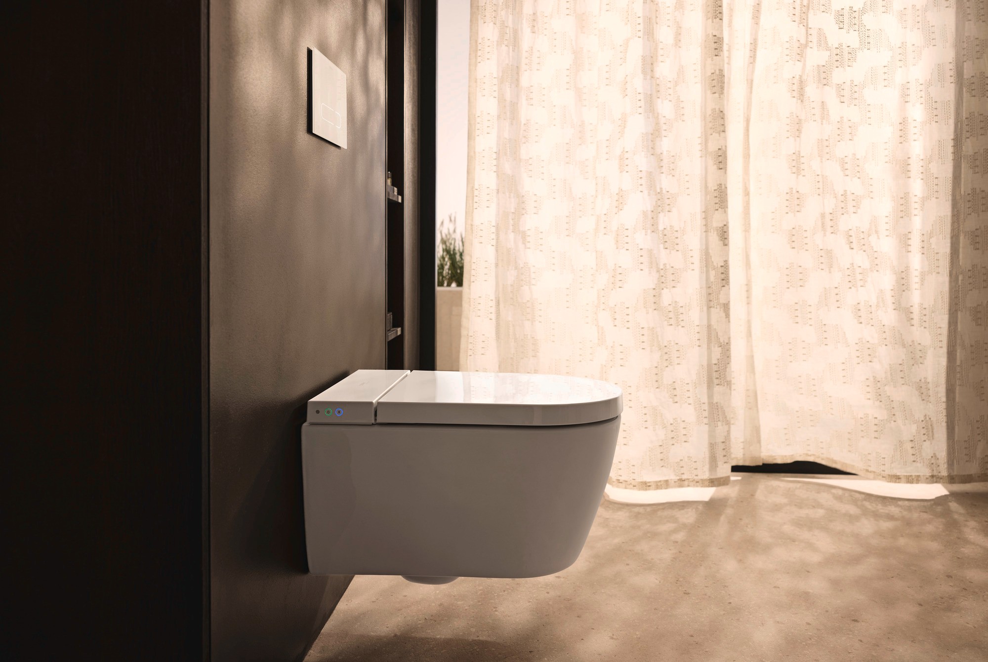
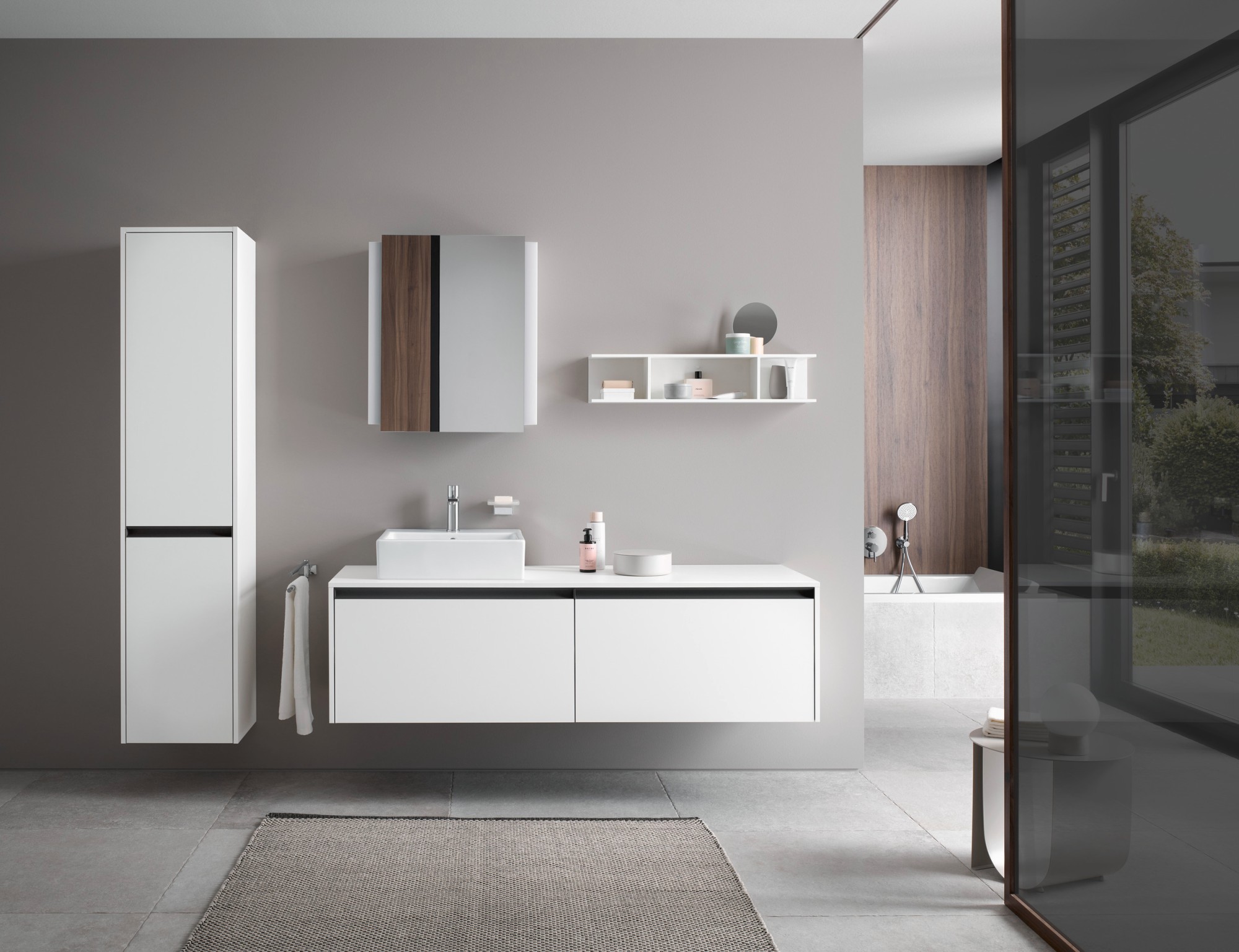
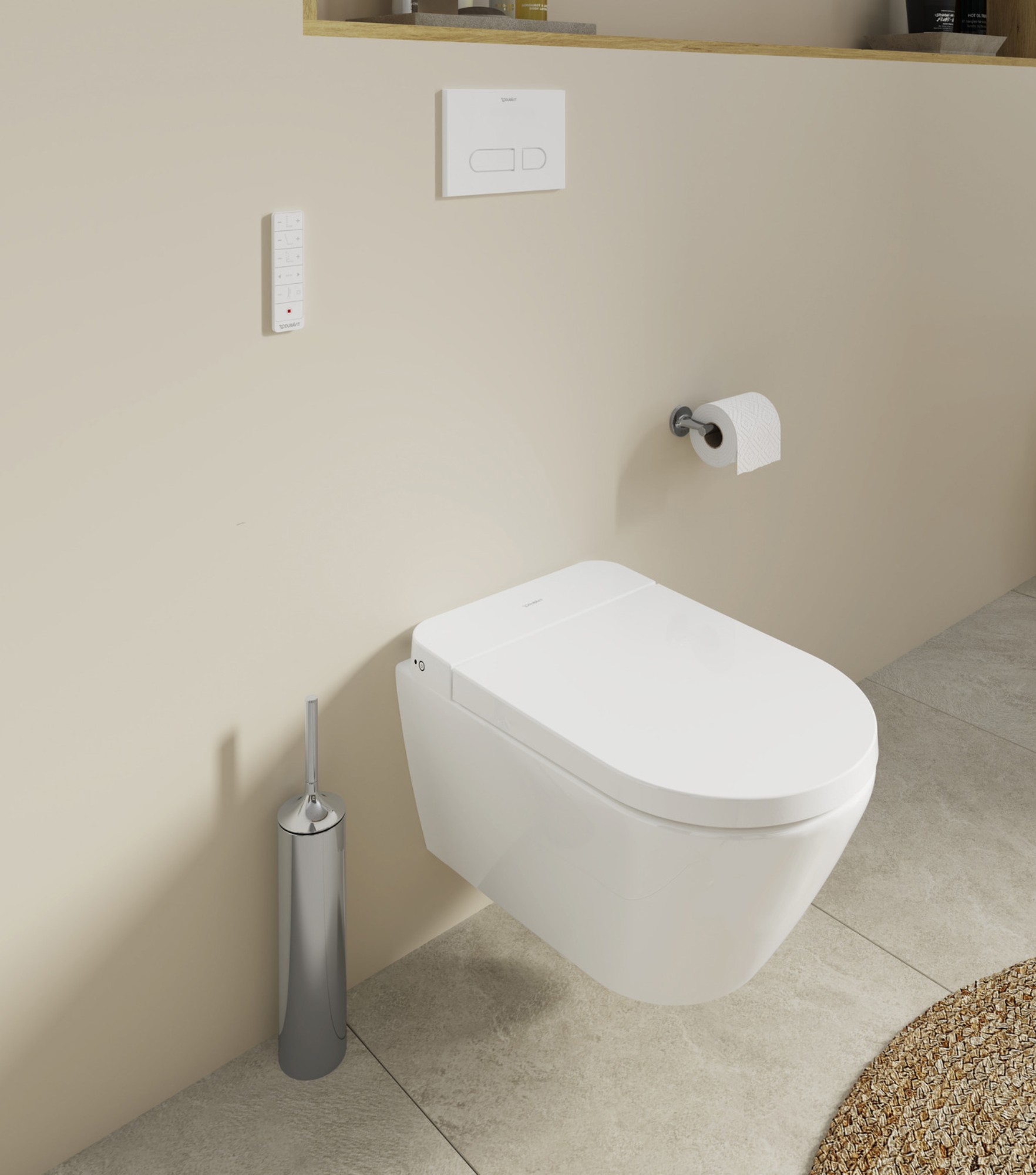
- Light shades lend the room a more open appearance, bold colors add striking highlights
- Walls, furniture, tiles and textiles allow colors to be applied in finely controlled doses
- White ceramics, wood and warm details provide for a well-balanced overall design
Product & Brand
Blue in balance
September 10, 2026

Shaping width and depth: How shades of blue endow the bathroom with serenity, structure and personality
Clear skies. Calm water. The open sea. Blue is all-pervasive in natural scenery and appears in myriad manifestations according to the prevailing light and depth. The association with water is particularly apparent in the bathroom. The palette extends from gentle sky blue to deep night blue. Proportional use of the different colors and the interplay with light and materials are crucial to achieving a well-balanced overall scenario. Duravit shows how blue can be applied to great effect in the bathroom.
From adding a dash of color to shaping an atmosphere
Blue influences the character of a bathroom in different ways, according to the color's brightness and intensity: Light shades make compact bathrooms appear more spacious in daylight. Pigeon blue lends a unity to walls, furniture and textiles, while dark shades of blue focus our attention and emphasize individual areas. Duravit's Luv vanity unit featuring a Night Blue Satin Matt finish, for example, serves as a striking highlight which guides the eye to the washing area. When used in small doses, this color lends structure to the room. Alternatively, it can be applied over extensive areas to conjure up a sense of depth and a cozy air. Matt surfaces deepen the color, while glazed tiles reflect the light.
Broad scope for different combinations
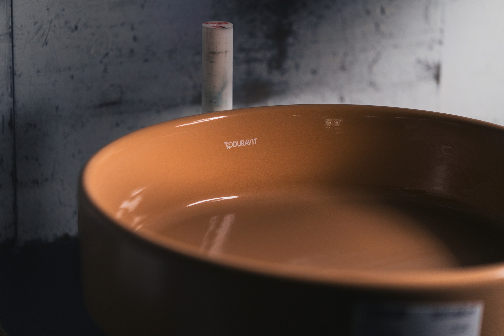
Accompanying colors and materials determine whether blue appears calm or rich in contrast. White ceramics combine with light shades of blue to create a harmonious whole, while deeper shades showcase the ceramics. Wood tones and sandy shades lend the bathroom warmth and provide the foundation for a natural color concept. Textiles, plants and metal surfaces add gentle structures, organic forms and fine highlights. Related colors continue the mellow design, while yellow, orange and terracotta provide vivid contrasts.


More details
Contact Us
We're glad you're considering Duravit as part of your research. We'd be happy to assist you with your media relations.
To the press inquiry