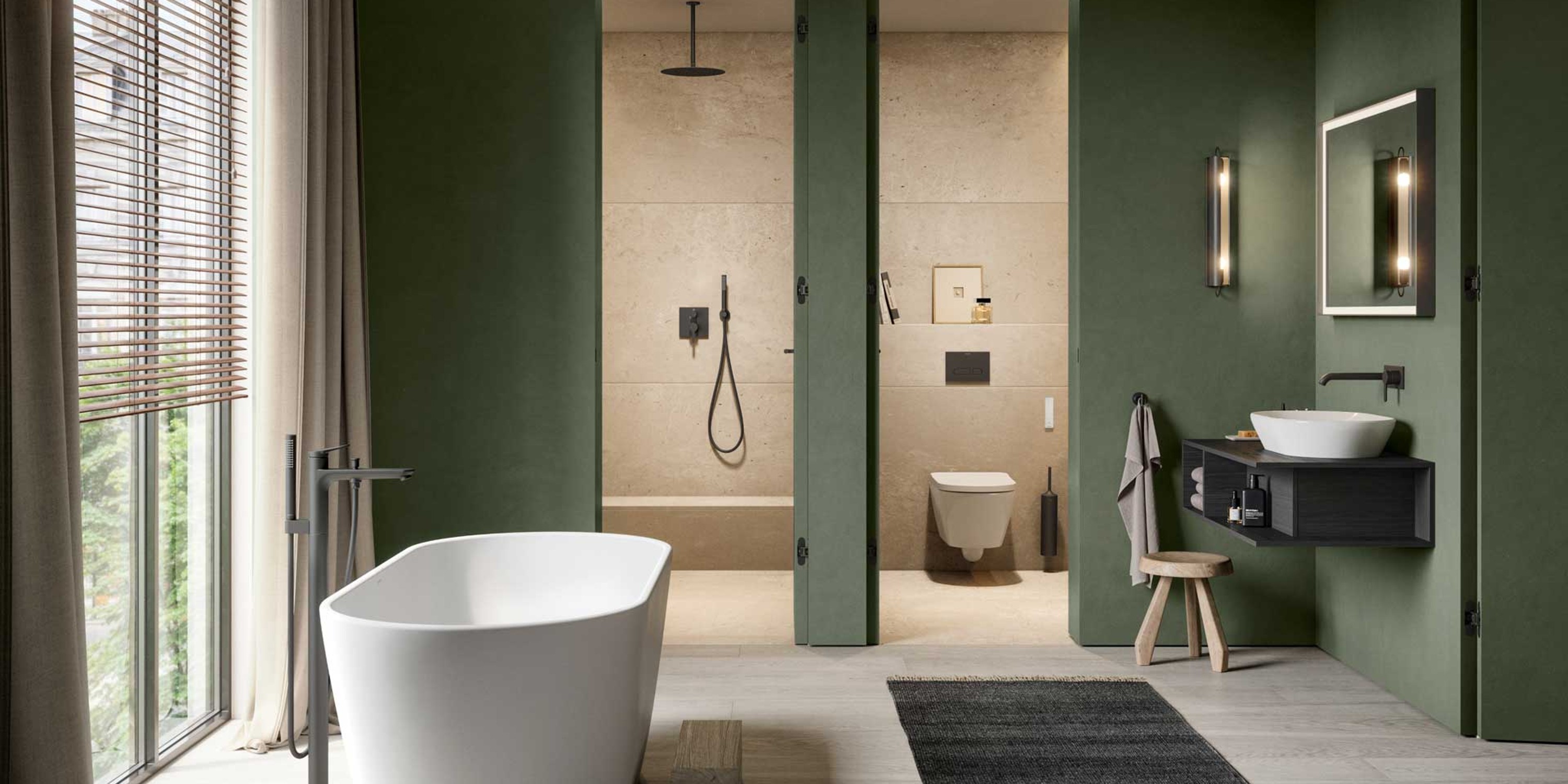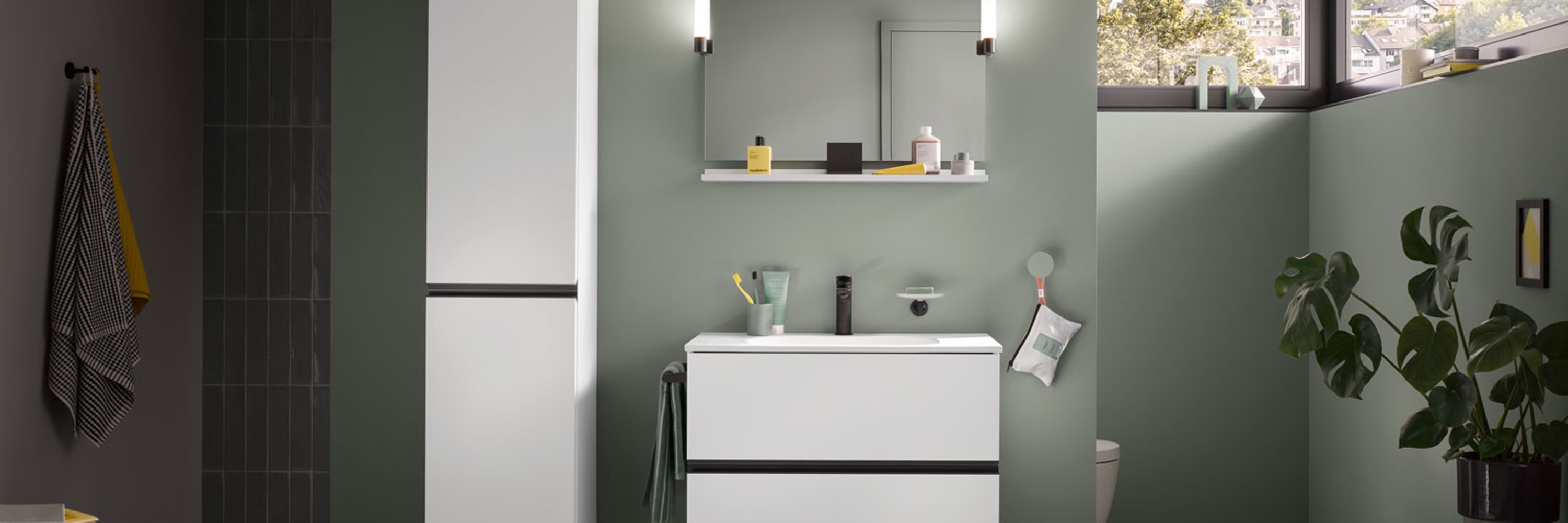
Pastel colors in the bathroom
Key points at a glance:
- Using pastel colors thoughtfully: Light, soft shades bring a sense of calm, freshness, and a welcoming atmosphere to the bathroom.
- Pair with natural materials: wood, natural stone, and matte finishes enhance the harmonious effect of pastel colors.
- Add strategic accents: Walls, furniture, or accessories in pastel shades create modern and stylish bathroom designs.
Effects and color palettes
Pastel shades are characterized by their high brightness and low saturation. This is exactly what makes pastel colors so appealing for bathrooms: they reflect light, make rooms feel more open, and create a warm, relaxed atmosphere. Especially in small or windowless bathrooms, pastel shades can help make the space feel less cramped. The following colors are particularly popular:

Sage green
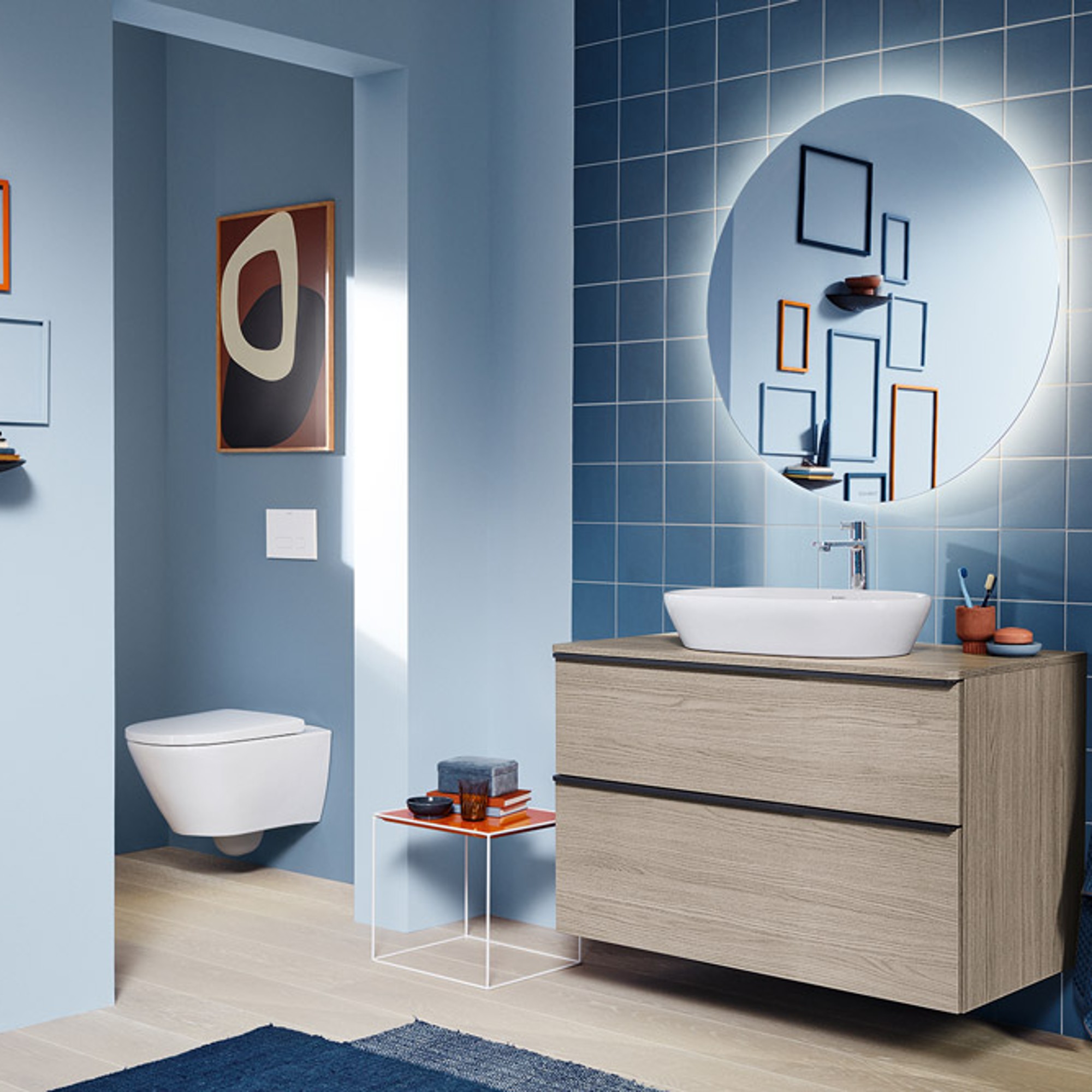
Pastel blue

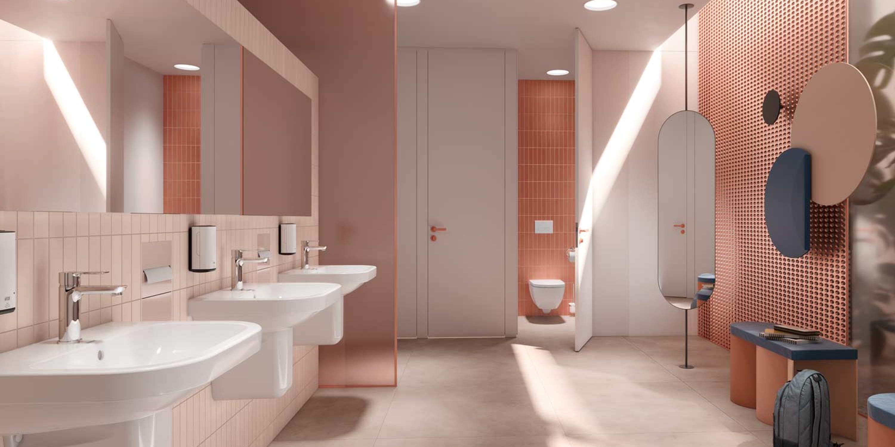
Rosé
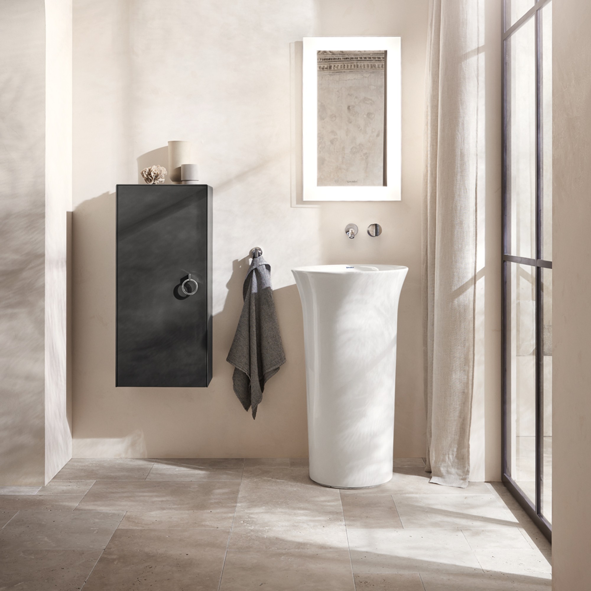
Beige
Combinations and styles
Pastel colors really come into their own when used in well-thought-out combinations. Tone-on-tone schemes create a particularly calming effect, especially when textiles and tiles are also in pastel or similar shades. Alternatively, pastel tones pair beautifully with white or light gray to create a sense of clarity and structure.
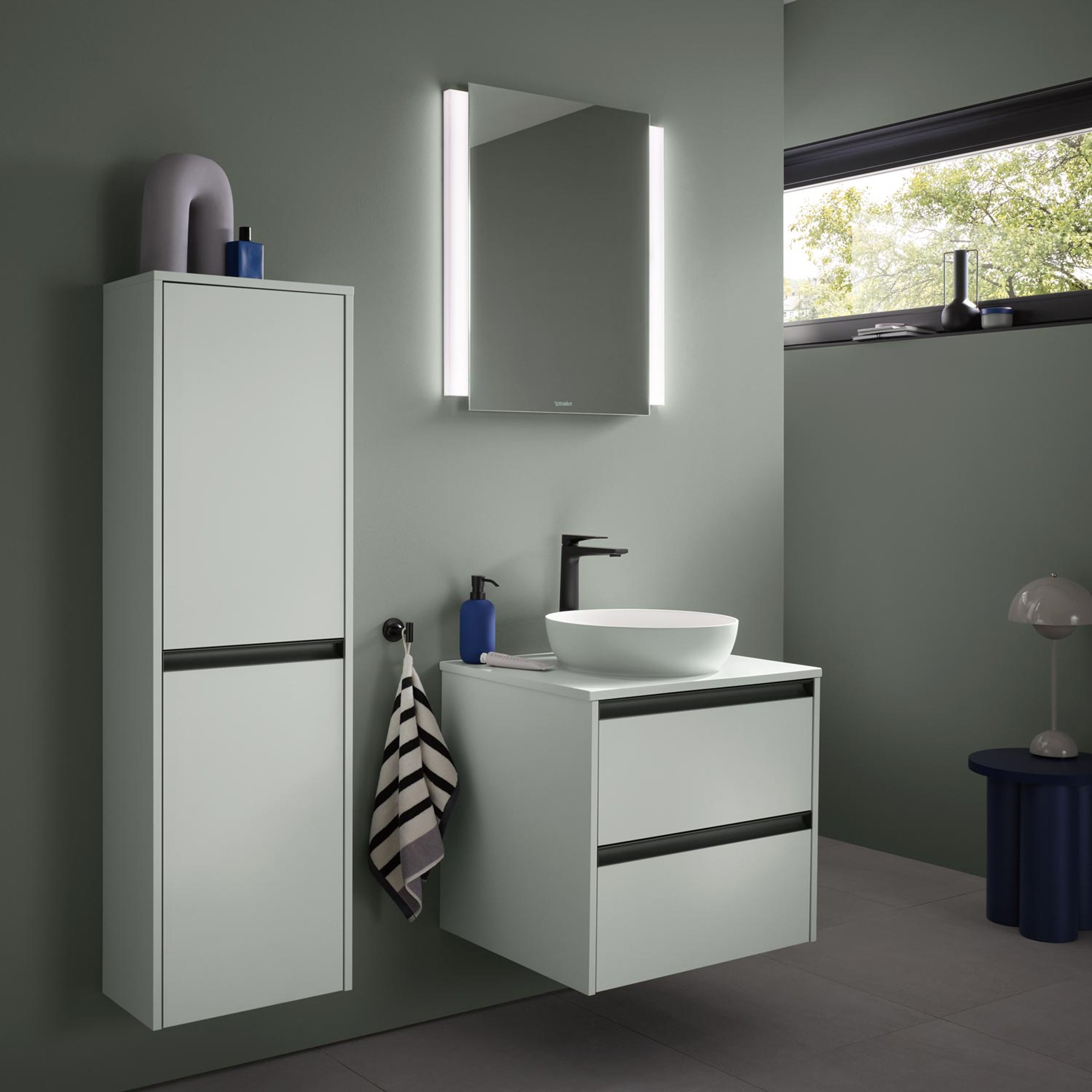
When paired with natural materials, pastel colors take on an added depth: wood brings warmth, while natural stone lends a sense of calm. Stylistically, pastel tones are a perfect fit for Scandinavian bathrooms, Japandi designs, or modern Mediterranean interpretations, where they offer a soft alternative to classic terracotta hues. But pastels also add elegant, understated accents to modern bathrooms.
Applications in the bathroom
There are many ways to use pastel colors in the bathroom. Depending on the desired effect, you can create accents in various ways.
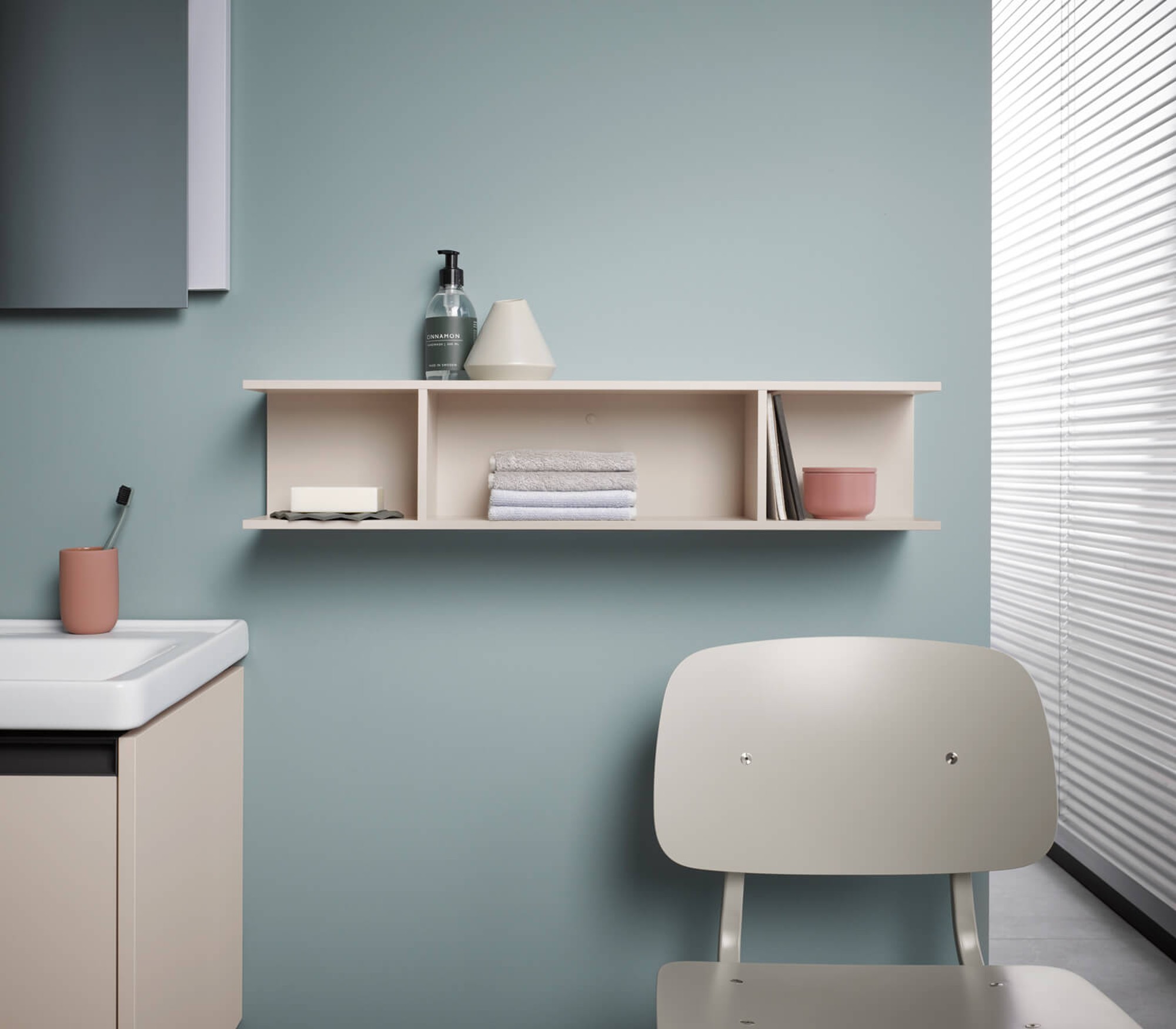
Walls

Furniture and faucets
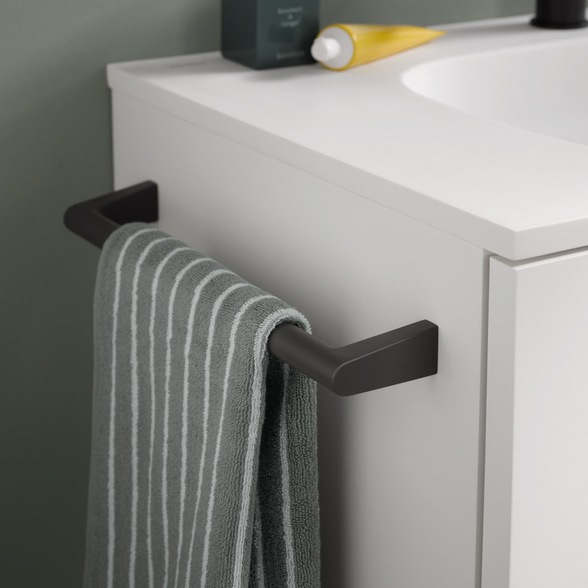
Accessories
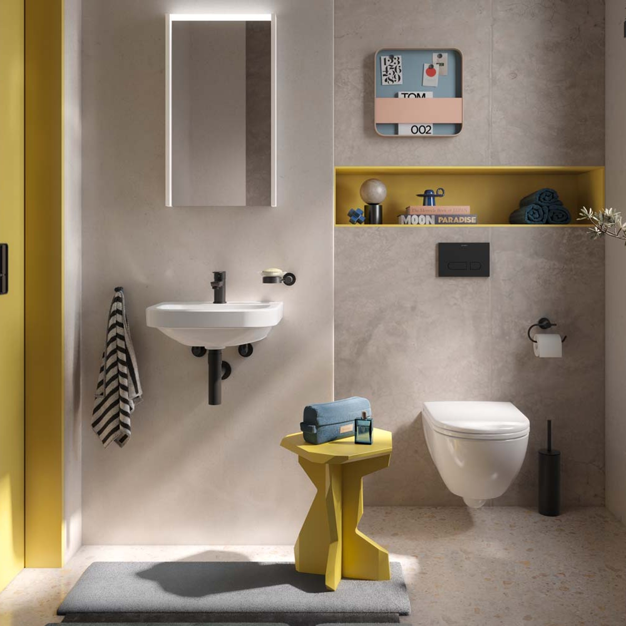
More design tips
When it comes to creating a harmonious pastel bathroom, less is more. Two coordinating shades are usually enough. Matte finishes look more sophisticated and serene than glossy ones. Lighting is just as important: natural daylight enhances the lightness of the colors, while warm white lighting prevents pastels from appearing cool or pale.
Pastel colors should be used thoughtfully—not in a playful way, but in a clean, minimalist style. When combined with simple shapes and high-quality materials, they truly come into their own.